
TLDR;
91.68% of browsers now support dark mode through the css prefers-color-scheme media query. With the arrival of the dark nights, more people are using apps and websites in “dark mode”. The bounce rate for sites with a dark theme is 60% lower than for sites with only a light mode. It’s time to develop a dark theme for your website.
What is dark mode?
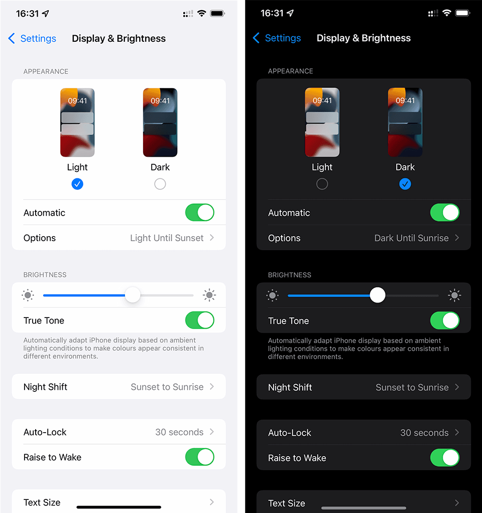
Firstly the terms have nothing to do with drug dealing or “the dark web”, dark mode simply refers to a device setting in which an app’s primary background colour is dark, with contrasting lighter text. A dark theme is a version of a website following the same principles. Here is an example of our own [website][1] in both light and dark versions:

A dark theme should be a compliment to, not a substitute for your current “light” theme.
Effect on bounce rates
Will a dark theme do anything to improve bounce rates? We decided to measure this for our own site. We discovered that for those users who enabled dark mode, the bounce rate was 63% lower when presented with a dark theme. Like all statistics, please take that number with a grain of salt - ours is a relatively low traffic site, accessed almost exclusively by corporate users, during working hours. The numbers may differ greatly for a consumer focused site.
Why the need?
Most studies show that dark text on a light background is more legible. For example, [Bauer and Cavonius (1980)][2] found that participants were 26% more accurate in reading text when they read it with dark characters on a light background. Various studies show how blue light from screens affects sleep quality. This article from [Harvard health][3] gives a brief overview. However, contrary to popular belief, dark mode/dark themes [do not improve sleep quality][4]. So why bother?
It’s all to do with the ambient light and [colour temperature][5]. During daylight hours we have bright sunlight entering from windows. Ok, maybe it’s no so bright, at least here in the UK! Bright or not, the daylight is “cool” - that’s to say it has a colour temperature somewhere between 5000 and 6500 Kelvin. Office workers will typically be exposed to artificial light with a similar colour temperature to daylight. When an LCD display renders “pure” white (#FFFFFF) or a colour close to white, it will have a colour temperature of between 6500 and 9500 Kelvin. In other words, it’s a bit cooler than the ambient light.
When darkness sets in, we lose the cool daylight. In a residential setting we typically replace the cool natural light with warm light sources. Typical warm domestic lighting has a colour temperature of account 3000 Kelvin. The difference between the ambient lighting and the white light from the LCD screen is now significant, being 2 to 3 times “cooler”. It’s this disparity that can make using a computer or phone seem uncomfortable. It can lead to eye strain and so-called “computer vision syndrome”.
The core problem is that the white on the screen is simply “too white” (cool) compared to the ambient light.
Night mode and dark mode
The tech companies like Apple recognised the problem. They came up with two solutions. The first is “night mode” aka “night shift”. This mode shifts the overall colour temperate of the device to the warmer end of the spectrum. White’s become softer and warmer, closer to the ambient artificial light sources. The second solution is dark mode which fundamentally changes the appearance of apps on the device. Here’s a screenshot of my iPhone in the different modes.
I should point out that dark mode is not for use exclusively during the evening. Some people prefer to use dark mode at all times. However, the majority of users will accept the default setting in which dark mode kicks in during the hours of darkness.
Dark mode for websites
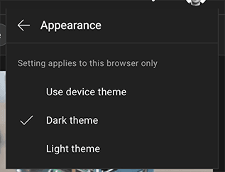
The native apps on the phone or computer are now in dark mode, hopefully helping to reduce eye strain. What happens when the user visits a website? By default, nothing - they see the same “light” website. Some sites allow visitors to explicitly toggle a dark theme, YouTube is a good example:
Manually selecting a dark theme (if available) is less than ideal, especially as the visitor must switch back again in the morning. Fortunately the W3C consortium came up with a proposal to align websites with the visitor’s device settings.
prefers-color-scheme
CSS media queries are used to develop responsive websites. Media queries are a client side technology. The same HTML and CSS code can render differently depending on the device being used, the orientation etc. Media queries can also be used to render a dark theme if the device is running in dark mode. This is possible because of a recent media query: prefers-color-scheme. Just as we can override css declarations for specific devices sizes, we can do the same for devices running in dark mode. Here’s a simple example:
body {
  background-color: white;
  color: black;
}

/* Notice how we invert the colours */
@media(prefers-color-scheme: dark) {
  body {
    background-color: black;
    color: white;
  }
}
The advantage of using this media query is that the site visitor doesn’t need to explicitly select a dark theme, it happens automatically. Their device could be running in dark mode because it’s evening, or because they choose dark mode permanently. Either way, their preference is reflected in the browser.
According to caniuse.com 91.68 of browsers now support the prefers-color-scheme media query
Dark mode in the real world
The example given is overly simplistic. In the real world our style sheets are far more complex. Here are some tips:
Use variables
if we’re not careful we’ll end up duplicating code, violating the DRY principle. Variables (css or preprocessor) become essential. Here’s an extended version of the code, rewritten using client side css variables:
:root {
    --bg-color: white;
    --txt-color: black;
}

@media (prefers-color-scheme: dark) {
    :root {
        --bg-color: black;
        --txt-color: white;
    }
}

body {
    background-color: var(--bg-color);
    color: var(--txt-color);
}

/* re-use --txt-color variable */
span {
  color: var(--txt-color);
}
Choose your colours carefully
CSS media queries allow us to change almost everything. That doesn’t mean we necessarily want to do so. Ideally you want to choose colours that work well for both the light and dark versions of your site. There are technical and commercial reasons for doing this. From a technical perspective it minimises the number of CSS overrides required, making the codebase easier to maintain. From a commercial perspective, the branding remains consistent across both light and dark versions of the site. When thinking about our own branding we took this into consideration, leading us to adopt a shade of red as the primary colour. Red goes well against both a light and dark background. The same would not be true if we had adopted dark grey.
Use transparent images
This catches lots of people out. Take a look at this screenshot from our home page:

The image has a transparent background, it blends into the overall background colour. Or does it? Let’s look at the same image in dark mode:

The image DID have a transparent background. Given that JPEG images are typically smaller than PNGs we decided to optimise by converting to JPEG. In doing so we lost the transparency but nobody noticed when viewing the site in light mode (during typical office hours). Lesson learned, we dropped the JPEG and switched to using SVGs with PNG as a fallback:

Apply css filters to images
Sometimes you can’t simply drop the background, most likely because you’re working with a raster image. The background may form an essential part of the image, ot it’s simply not possible to cleanly remove it. In this case you have a few options.
The first is to use a CSS filter to invert the colours. Here’s an example of the sort of HTML and CSS you would use:
<img class="image invert" src="..." />@media (prefers-color-scheme: dark) {
.image.invert {
filter: invert(100%);
}
}We use this approach for some of our blog posts. Here’s an image rendered in normal “light” mode
And the same image in dark mode:
Of course, this approach will not work for photos or anything else in which the colours themselves are an essential component of the image. In these cases we have a couple of other options:
The first is to use an opacity filter to reduce the image opacity, basically reducing the contrast between the image itself and the background colour:
@media (prefers-color-scheme: dark) {
  .image.contrast {
    filter: opacity(70%);
  }
}
The second approach is simply to reduce the brightness:
@media (prefers-color-scheme: dark) {
  .image.dim {
    filter: brightness(70%);
  }
}
Swap out images
Finally, if none of these approaches work we can adopt the nuclear option - displaying different images for each theme. This is pretty simple in the case of CSS background images, we just select use the prefers-color-scheme query and specify a different image url or data source. Here’s an example from our own website (one of the social media links in the footer)
.vk-twitter {
  background-image: url("twitter.svg");
  background-repeat: no-repeat;
  height: 20px;
  width: 20px;
}

@media (prefers-color-scheme: dark) {
  .vk-twitter {
    background-image: url("twitter-dk.svg");
  }
}
For regular images we can use the new HTML picture element with a media query. Here’s another example from our site ( the main logo):
<picture>
  <source
    srcset="viko.dark.svg"
    type="image/svg+xml"
    media="(prefers-color-scheme: dark)" />

  <source
    srcset="viko.svg"
    type="image/svg+xml" />

  <img src="/viko.png"
     width="148"
     height="35"
     alt="Viko Ai Logo" />
</picture>
In this case the browser will render the dark logo when in dark mode, otherwise the regular logo. If the browser doesn’t support SVGs or the picture element it will just fall back to the standard png image.
Watch out for plugins
You’ve finally built a dark theme for your site. It looks great, but you missed something … plugins. You almost certainly use some third party plugin like a live chat or ask a question type plugin. How do these plugins look against you’re new dark theme?
Here’s an example of our own chatbot plugin in both light and dark modes:
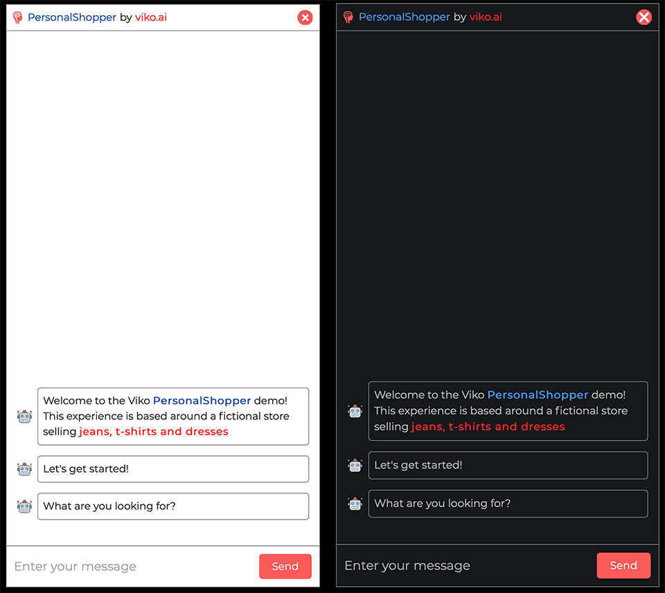
Make sure your plugins also support dark mode!